|
Throughout the articles that we have read in the past weeks, I keep getting led back to the topic of relationships in the art world. It seems to many that the art that is in a museum should be there because of the technical skill or aesthetic beauty that it exposes to the world, but through these articles it seems to me that more often than not there is another layer of reasoning behind why certain works get famous.
In history, artwork has usually been conscripted, a work has been created because it was specifically needed for some place or event. Likewise, the Lincoln Memorial was created to offer commemoration of an extraordinary man that changed our country forever; yet the way that they presented their conscription differed from normal. In making the monument into a contest with the best piece winning, they changed the way that the artist was involved; he wasn't found and asked to do a piece because of his previous prestige, but he had to work and submit designs in order to gain the trust of those who would pay for the monument to be built. This happens today as well, there are many art competitions such as the Scholastic Art & Writing Awards, but who are the judges sitting behind the table who determine who is the winner there? I'm not saying that the Scholastic Art Awards are biased, just making the observation that even at that level of competition where it is technically done so students with good art get scholarship money, there are still opportunities for people with connections to somehow come out on top. This problem goes back in the art world farther than I ever imagined, especially after reading the article about Georgia O'Keeffe and female artists. With the entire population of the planet being roughly 50% male and 50% female with marginal genetic differences, I don't see how it is possible for male artists to make work that is so much better than female artists that it utterly dominates the market. There simply has to be some sort of 'man'ipulation going on. To go back to one of the most fundamental arguments, when it comes to art we must consider what really makes art worthy of being in a museum or winning an award in the first place. Is it if the art looks good or shows technical skill? No, it is actually determined by so many factors that are completely out of the artist's control that it is almost impossible for those factors to turn in your favor in your lifetime. It is all determined by the collectors, the guys with all the money at the top who are pulling the strings; and they can be quite unpredictable, as humans all are. But to end this post on a good note, what does it matter if your art gets put in a gallery or sold for a hundred million dollars; if you like it then it is worth the world over.
0 Comments
George Ferrandi is unique, not in any specific piece of work that she has done, but in the sheer variety and size of the works that she has amassed. Her creativity seems to go a dimension beyond normal artists, working on canvas or trying something different in terms of their drawing style, but she can seemingly change her entire vision by what opportunities arise around her. I don't want to talk a lot about her education as it is clear that she has done a lot in school and now does a lot for schools, but it is remarkable the amount of things that she has done, not only does she do work like what is shown above, but she organized a performing project and actually won grant money for her performances.
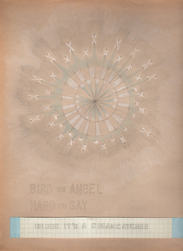
Particularly interesting is her performance that involved space between strangers, she thought of the space as a malleable thing; the room between individuals is not just open space but also room where our social behaviors lie and can be broken in order to restore humanity to a somewhat desolate environment, the subways. Of course it was a dangerous thing to do, just resting her head on strangers shoulders, but it had to be done, if not for art, then for experiment. I guess it comes back to what we consider art, and how we choose to perform this art is different for every artist. George thinks of her 'performances' as art, whereas other people might see them as annoyances and a breach of privacy; I guess we need a good artist every once in a while to reassure us that our perception of reality is not universal, and neither is our perception of art.  zeroI just recently joined this closed beta social media site called 'ello' and it has some really great artists on there. I think because it has a really small base and it is closed unless you get an invite, super hipster artsy people post their stuff there because they think it's cool (p.s. it is cool, I post my stuff there too). Anyways, you can find some really great artists on there, and this is a great example, I have no clue what this even is, but the range of colors that Sydneysie achieves in this small piece is breathtaking, I need to incorporate some of these colors into my pieces, in fact this is a bit similar to my piece called Foci. Here is her page http://cargocollective.com/sydneysie/Zero
Beeple (along with Justin Maller) is my biggest inspiration lately, he makes a piece per day just like Justin's Facets, and every one is remarkably different. And the scary thing about it is he does it all with Cinema4D and Adobe After Effects. Some of his pieces look like photographs, they are so beautiful and so strange at once, it is perplexing and exciting for me, in my early phase of learning how this works. Anyways, he is awesome and if you want to see some more of his work/files go here. http://www.beeple-crap.com/index.php
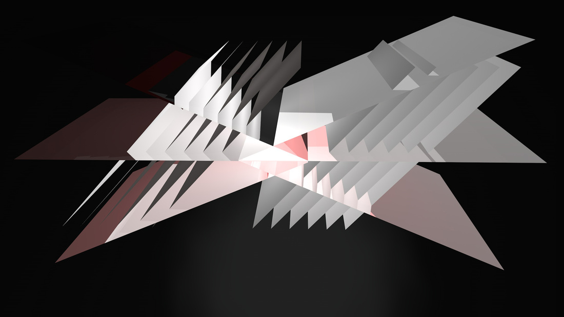
 For my final piece, I continued with the concept of land forms and combined it with sharp edged rectangular prisms. I messed with the lighting for a while, but ultimately I wanted a sort of bleak background color because my piece is about the earth, and how with our sharp edges and geometry, we are ruining the natural and infinite beauty that is all over it. Yet, instead of the green color scheme you usually see with environment messages, I thought doing something in red and blue would be better, or at least more my style because for some reason I end up using those colors quite a bit. I added very faint red and blue lighting to the right and left edges to add a bit of interest and show the transition that occurs throughout the piece and throughout time. It may not be a traditional place project, but I learned a lot in making it and it conveys a message that I feel is extremely important, and that message is about the place we live.

This day I messed with more glass but added in some landscape/water to get more atmosphere, and chose some colors. Didn't really mess with lighting.
 I think I made this the day after my first version and I had just started learning how to make glass-like textures so I could use light more effectively. This piece ended up really bright and I was going to go with a green color scheme for my final piece, but it turned out a bit differently, nonetheless some of the textures I made here I reused later and found new ways of exploiting them for different results.
 Over the looong weekend I decided to start learning how to make art in Cinema4D, it was a fun experience. This was the first piece that I made that is actually worth sharing, still just a sort of practice piece so I could learn how positioning and different textures worked.
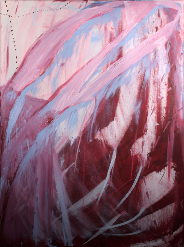 This is the final shot and I am really happy with how it turned out, it really balances the hard and soft edges and slick and rough lines I wanted, and the color scheme is a bit different for me in terms of the pink, but I will try this scheme out again in the future. Overall it was a really fun project.
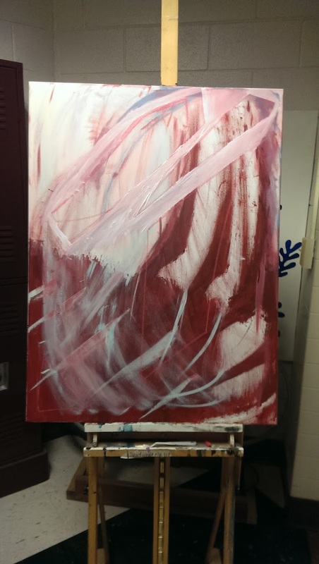 We didn't work on these pieces very long, but I really liked how it started looking this day. I don't know if it looks better here or in the final product, but either way I enjoyed the process and I think it was turning out well at this point.
|


